
Website Design for Lead Generation: 7 Proven Strategies That Convert

Your website is not just a digital presence it’s your most powerful lead generation tool. While many businesses focus heavily on driving traffic, they often overlook what truly matters: converting that traffic into leads.

A well-designed website doesn’t just look good. It guides visitors, builds trust, and encourages action. In today’s competitive digital space, design plays a direct role in how many leads you generate.

Here are seven proven website design strategies that help turn visitors into high-quality leads.

Website Design for Lead Generation: 7 Strategies That Convert
1. Create a Clear and Focused Value Proposition

The first few seconds on your website decide whether a visitor stays or leaves. If your message is unclear, users are less likely to take the next step. Your homepage should instantly communicate what you offer, who it is for, and why it matters. Avoid vague messaging and focus on a strong value proposition that clearly shows visitors how you can solve their problem, making them more likely to engage and take action.

2. Use Strategic Call-to-Actions (CTAs)

A website without clear CTAs is like a store without a salesperson because visitors need guidance on what to do next. Effective CTAs should be visible, easy to find, use action-oriented language, and appear multiple times across the page. Instead of generic buttons like “Submit,” use more compelling phrases such as “Get Your Free Consultation” or “Start Your Growth Journey.” The clearer and more engaging the action, the more likely visitors are to convert.

3. Optimize for Mobile Experience

A large portion of website traffic now comes from mobile devices, and if your website is not mobile-friendly, you could be losing valuable leads. To create a better user experience, ensure that pages load quickly, content is easy to read on smaller screens, and buttons are simple to locate and click. A seamless mobile experience keeps visitors engaged and significantly increases the chances of conversion.

4. Simplify Navigation and User Journey

Complex navigation can confuse users and increase drop-off rates, making it harder for visitors to take action. Your website should guide users smoothly from discovery to conversion through a simple and intuitive experience. Keep menus clean and minimal, highlight important pages clearly, and reduce unnecessary steps in the user journey. When visitors can quickly find what they need, it creates a better experience and improves lead generation performance.

5. Build Trust Through Social Proof

People trust people, and before taking action, users often look for proof that your brand can deliver results. You can build trust by showcasing client testimonials, case studies, reviews and ratings, and logos of brands you’ve worked with. These elements act as social proof, reducing hesitation and increasing confidence in your brand, which ultimately makes visitors more likely to convert.

6. Use Lead Capture Forms Strategically

Forms are the gateway to lead generation, but poorly designed forms can significantly reduce conversions. To improve performance, keep forms short and simple, ask only for essential information, and place them in high-visibility areas across your website. You can also use pop-ups or exit-intent forms to capture leads before users leave the site. The easier and more convenient the process is, the more likely users are to complete the form and convert.

7. Focus on Speed and Performance

Website speed has a direct impact on user behavior, as slow-loading pages can increase bounce rates and reduce conversions. To improve performance, compress images, use clean and efficient design practices, and minimize unnecessary elements that can slow down the site. A fast-loading website not only creates a better user experience but also supports stronger SEO performance, helping your business attract and retain more visitors.

Conclusion

Website design is no longer just about aesthetics, it’s about performance. Every element on your website should guide users toward taking action.

From clear messaging and strong CTAs to mobile optimization and trust-building elements, each strategy plays a role in improving lead generation. When all these components work together, your website becomes a powerful conversion engine.

At Upswing, we help businesses design websites that don’t just attract visitors but turn them into qualified leads. Because in today’s digital landscape, success is not measured by traffic it’s measured by conversions.

Reduce Ad Spend While Increasing Conversions

In today’s shifting online scene, businesses across Kerala constantly search for better ways to reduce ad spend while increasing conversions to use their ad money wisely without losing impact. Digital marketing costs are rising on Meta, Google, and LinkedIn, yet results can still stay strong. Smaller spending works if you focus on smart choices based on real data instead of just pumping cash.

This blog explains how to reduce ad spend while increasing conversions. So if you’re just starting out, running a small shop, or expanding your team, these practical tricks make ads work harder.  Skip the guesswork and use strategies proven to pull in buyers. Every tip stretches your budget, turning small spends into bigger wins. No hype here. just practical moves used by businesses just like yours.

Why Spending Less Can Deliver Better Results

Most companies think more cash brings more sales. Yet actual gains happen only when things are spot-on. Wrong targeting, dull creatives, slow landing pages, or broken funnels waste money instead. Once the businesses get sorted, you can gain better returns even on tighter funds. To Reduce Ad Spend While Increasing Conversions

Loads of companies in India have seen it themselves: not higher sales from bigger budgets, but better results through improved strategies.

Reduce Ad Spend & Increase Conversions: A Complete Guide

Optimize Audience Targeting for Higher Precision

Focusing on the right crowd makes ad spending smarter. When your message hits people already curious about what you offer, each click counts more for performance marketing.

Leverage High-Intent Custom Audiences

Focus first on people who have already interacted with your brand, such as website visitors, users who added products to their cart, lead form viewers, social media engagers, and video viewers. These audiences are more likely to convert, helping you reduce customer acquisition cost quickly.

Use Lookalike Audiences for Smart Expansion

You can expand your reach by targeting people who closely resemble your existing customers. This allows you to reach new but relevant audiences, improving conversion rates without increasing ad spend.

Exclude Low-Value Audiences

Avoid targeting current users when your goal is to acquire new customers, as well as people who rarely engage or fall outside your relevant demographics. Focusing on a smaller, high-quality audience improves return on ad spend.

Strengthen Creatives to Lower CPC and Boost Engagement

Good ad designs shape most of a campaign’s success. When visuals connect emotionally, people click more and cost per click (CPC) drops.

Hook the Audience in the First 3 Seconds

Since users scroll quickly, your ad should immediately capture attention with a strong opening, such as a powerful statement, a short testimonial, or a relatable situation that resonates with your audience.

Use Emotion-Driven Storytelling

Stories work better than sales pitches because they build connections. This improves engagement rate and leads to more actions without increasing spending.

Add Social Proof in the Creative

Including elements like high ratings, customer numbers, or trust badges such as “4.9★ Rated,” “5000+ Happy Customers,” or “Kerala’s Trusted Brand” builds credibility and increases trust in your ads.

Keep Testing Multiple Creative Versions

Continuously test different headlines, visuals, calls to action, and ad formats. This A/B testing approach helps identify high-performing creatives early and reduces wasted ad spend.

Improve Landing Pages for Higher Conversion Rates

Even the strongest ads will fail if the landing page is weak.

Make Your Page Clean, Fast, and Focused

A strong landing page should load quickly, have a clean design, clearly highlight benefits, and display a clear call-to-action above the fold. This creates a smooth user experience and improves conversion rates.

Build Trust With Social Proof

You can increase trust by adding testimonials, case studies, Google reviews, and showcasing brand achievements, which reassure visitors and encourage them to take action.

Use High-Intent Calls to Action

Replace generic CTAs with more action-driven phrases such as “Book Your Free Consultation,” “Get a Custom Quote,” or “Try It Today,” as these often lead to better conversions.

Use Analytics to Prevent Budget Waste

It is important to monitor performance metrics such as click-through rate (CTR), cost per click (CPC), cost per acquisition (CPA), return on ad spend (ROAS), and conversion rate. If a campaign underperforms, pause it within a few days and scale only the successful ones.

Build Multi-Layer Retargeting Flows

Segment your retargeting campaigns based on user behaviour, such as targeting high-intent visitors within 3 days, add-to-cart users within 7 days, and general engagers within 30 days to improve efficiency.

Use WhatsApp-Based Retargeting

Engaging warm leads through WhatsApp can significantly improve conversion rates and shorten the sales cycle, making it a cost-effective retargeting method.

Build a Full-Funnel Strategy for Consistent Results

Create a structured funnel where top-of-funnel content focuses on awareness through education, middle-of-funnel content builds trust with proof and benefits, and bottom-of-funnel campaigns drive conversions using strong CTAs and remarketing ads.

Conclusion

Slashing ad costs while boosting sales isn’t down to axing efforts. It’s fine-tuning them. Once companies pivot from scattergun posts to smarter moves, each rupee earns more. Reduce Ad Spend While Increasing Conversions By blending sharp audience picks with strong visuals, smooth landing zones, repeat nudges, split checks, and smart bots, firms win bigger outcomes on the same budget.

In a crowded market, bigger budgets don’t always win; sharp choices do. Firms that get how people act use real insights, and we need to focus on reduce ad spend while increasing conversions.

Over at Upswing Digital, we’re all about giving brands an edge by beating rivals through sharper thinking instead of bigger budgets. We Reduce Ad Spend While Increasing Conversions. When it comes to hitting goals like better returns, more sales, or spending less to grab customers, clever ads make the most sense.

Why Mobile-First Website Design matters?

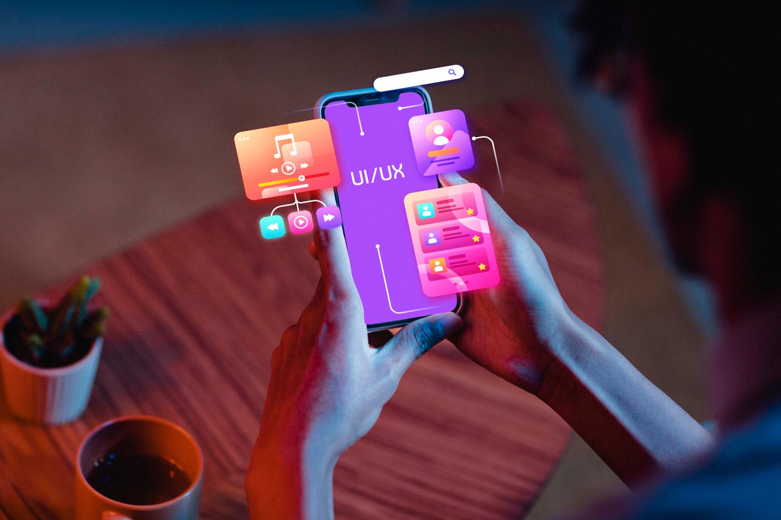
Person holding a smartphone displaying a vibrant UI/UX interface, surrounded by floating app icons and digital elements, representing Mobile-First Website Design focused on intuitive navigation, responsive layouts, and optimized user experience for mobile users.

In today’s digital era, smartphones are no longer just communication tools, they’re the primary gateway to the internet. With over half of global web traffic coming from mobile devices, having a mobile-first website design is no longer optional. It’s a necessity.

At Upswing Digital, we believe that businesses must prioritize user experience (UX), speed, and functionality on mobile screens first to ensure they stay competitive. In this blog, we’ll explore the concept of mobile-first design, why it matters, and how it benefits your business from both an SEO and user engagement standpoint.

Clean and modern dashboard interface showcasing Mobile-First Website Design with responsive layouts optimized for smartphones, highlighting user-friendly navigation, scalable typography, and intuitive touch controls.

What Is Mobile-First Website Design?

Mobile-first website design is a design strategy that starts with the mobile version of a website and then scales up for larger screens like tablets and desktops. Rather than designing a desktop website and then shrinking it to fit smaller devices, mobile-first begins with the smallest screen and builds upward.

This approach ensures that essential content, functions, and user experiences are optimized for mobile users before adding layers of complexity for larger devices.

Key Characteristics of Mobile-First Website Design:

  • Simplified navigation
  • Fast loading speed
  • Touch-friendly UI elements
  • Prioritized content
  • Responsive design framework

Why does It MATTER in 2025?

1. The Rise in Mobile Users

According to recent data, mobile devices account for more than 60% of total web traffic globally. Consumers are browsing, shopping, and engaging with content more on mobile than desktop. If your website isn’t designed with these users in mind, you risk losing a significant chunk of potential customers.

2. Improved User Experience

User experience is at the core of any successful digital strategy. A website that is hard to navigate on a mobile device will likely frustrate users and cause them to bounce. Mobile-first websites ensure that:

  • Buttons are easy to tap
  • Content is readable without zooming
  • Pages load quickly on mobile networks
  • Menus are simplified and accessible

Happy users are more likely to stay longer, engage with content, and convert into customers.

3. SEO Benefits

Google uses mobile-first indexing, which means it primarily uses the mobile version of your content for ranking and indexing purposes. If your mobile site is subpar, your SEO rankings could suffer.

Benefits of mobile-first for SEO:

  • Faster load times (a ranking factor)
  • Lower bounce rates
  • Better usability signals to Google
  • Higher chances of appearing in local search
4. Faster Page Load Speed

Page speed is critical, especially on mobile. Mobile-first designs focus on lightweight code, optimized images, and minimal scripts that improve performance. Since many users rely on mobile networks rather than broadband, a quick-loading mobile site can significantly enhance engagement.

Tips for faster mobile load times:

  • Compress images
  • Use lazy loading
  • Minimize CSS and JavaScript
  • Choose mobile-optimized fonts
5. Increased Conversions

Users behave differently on mobile than on desktop. They expect fast, easy access to information and streamlined actions. A mobile-first website focuses on:

  • Simplified forms
  • One-click call buttons
  • Easy checkouts
  • Minimal distractions

By making conversions easier on smaller screens, you increase the likelihood of turning visitors into customers.

Key Elements of Effective Mobile-First Website Design

1. Responsive Design

A responsive website adapts to all screen sizes, whether it’s a smartphone, tablet, or desktop. Mobile-first design ensures that the layout adjusts fluidly, providing consistent UX across devices.

2. Prioritized Content

On a small screen, space is limited. Mobile-first design pushes you to focus on what truly matters. Use clear calls to action (CTAs), concise headlines, and minimal copy to communicate your value fast.

3. Navigation Simplicity

Mega-menus and complex navigations don’t work well on mobile. Use:

  • Hamburger menus
  • Sticky navigation bars
  • Bottom navigation (for thumb access)

This makes your site intuitive and easy to explore on mobile.

4. Touch Optimization

Buttons, forms, and links should be designed for touch, not mouse clicks. That means:

  • Larger tap targets
  • Adequate spacing between elements
  • Minimal typing requirements
5. Minimal Design Approach

A clean, clutter-free mobile interface not only looks modern but also helps reduce load times and improve usability. Focus on white space, flat icons, and lightweight visuals.

Conclusion

Mobile-first website design isn’t just good practice, it’s essential in a mobile-dominated digital world. From better SEO and faster performance to higher user engagement and conversions, the benefits of going mobile-first are clear. Your website should not just “work” on mobile, it should shine on mobile.

If your current website struggles to meet the expectations of mobile users, it’s time for a change. A mobile-first approach sets the stage for long-term digital success, improves user satisfaction, and aligns with search engine best practices. Make your website future-ready, start with mobile.

Website Design in Kochi: Top UX/UI Tips for User-Friendly DESIGN

In today’s digital world, your website is often a customer’s first impression. For businesses seeking website design in Kochi, a user-friendly site can make all the difference. It needs to look great and work smoothly to turn visitors into customers. That’s where a website designing company in Kochi shines, using UX (User Experience) and UI (User Interface) best practices. So, what are these practices? Let’s explore how to create websites that are easy to use and drive conversions, especially for Kochi’s vibrant market.
Why UX/UI Matters for website design in Kochi?

First, let’s understand why UX/UI is key for website design in Kochi. UX ensures the site feels intuitive, while UI focuses on visuals like buttons and layouts. Together, they create a seamless experience. However, a poorly designed site can frustrate users, leading to lost sales. In Kochi’s diverse business scene—from tourism to tech—a well-designed website sets you apart. Here’s why it’s critical:

  • Engages Visitors: A smooth experience keeps users on your site longer.
  • Boosts Conversions: A Clear design guides users to buy or contact you.
  • Builds Trust: Professional visuals show you’re reliable.

A website design company in Kochi can help you achieve this, ensuring your site is both beautiful and functional.

Know Your Users

To start, great website design in Kochi begins with understanding your audience. Who are they? Tourists, locals, or businesses? A website designing company in Kochi should dig into their needs. For example, a Kochi restaurant site might need easy menu access and booking options. Here’s how to focus on users:

  1. Create user personas to map out their goals.

    2. Ask for feedback through surveys or reviews.

    3. Test designs with real people to spot issues.

    By putting users first, you build a site that feels personal and drives action.

    Keep Navigation Simple

    Next, navigation can make or break a website. If users can’t find what they need, they’ll leave. So, a website designing company in Kochi should keep the menus clear and logical. For instance, a Kochi travel site should highlight “Tours” or “Book Now.” Try these tips:

    • Limit menu items to 5–7 for clarity.
    • Use a sticky navigation bar for easy access.
    • Add a search icon for quick content lookup.

    With simple navigation, users stay engaged and are more likely to convert.

    Design for Mobile

    Moreover, mobile use is huge in Kochi’s tech-savvy market. Therefore, website design in Kochi must prioritise mobile-first design. A website designing company in Kochi ensures your site looks great on phones and tablets. Here’s how:

    • Use responsive layouts that adjust to any screen.
    • Make buttons large for easy tapping.
    • Test with tools like Google’s Mobile-Friendly Test.

    A mobile-friendly site keeps users happy, especially when they’re browsing on the go.

    Speed Up Your Site

    Additionally, nobody likes a slow website. Users may leave if it takes over 3 seconds to load. For website design in Kochi, speed is a must. A website designing company in Kochi can optimise your site with these steps:

    • Compress images to reduce file size.
    • Minify code like CSS and JavaScript.
    • Choose a fast host with local servers.

    A quick site improves UX and even helps with SEO, bringing more visitors.

    For a User-Friendly Website Design in Kochi, Make It Visually Stunning

    Furthermore, visuals set the tone for your site. For website design in Kochi, think of colours inspired by Kerala’s lush landscapes. A website designing company in Kochi should create a clean, inviting look. Consider these tips:

    • Stick to 2–3 main colours for harmony.
    • Use clear fonts like Roboto for readability.
    • Add whitespace to avoid clutter.

    A beautiful UI grabs attention and makes users want to explore more.

    A designer working on website design in Kochi at a desk with dual monitors displaying colourful layouts, surrounded by design software icons like Adobe XD, Illustrator, and a rocket symbol, with a bookshelf and plant in the background.

    Craft a Strong CALL TO action

    Also, clear calls-to-action (CTAs) drive conversions. Whether it’s “Buy Now” or “Contact Us,” CTAs should pop. A website designing company in Kochi can make them effective with these ideas:

    • Use bold colours like orange for buttons.
    • Write action words like “Discover” or “Start.”
    • Place CTAs where users can’t miss them.

    A CTA like “Shop Local Today” can spark clicks and sales for a Kochi shop.

    Ensure Accessibility

    Equally important, your site should welcome everyone. Accessibility matters for website design in Kochi, especially to reach diverse users. A website designing company in Kochi can follow these rules:

    • Add alt text to describe images.
    • Make the site navigable by keyboard.
    • Use high-contrast colours for visibility.

    An accessible site shows you care and can boost your reach

    Organise Content Clearly with a user-friendly website design in Kochi

    Besides, how you present content matters. A clear structure helps users find information fast. For website design in Kochi, use a strong hierarchy. A website designing company in Kochi might suggest:

    • Highlight key info with big headings.
    • Break text into short, skimmable chunks.
    • Add visuals like icons to guide the eye.

    This keeps users focused and moves them toward your goals.

    Test and Improve: the need for a website design company in kochi

    What’s more, great design requires ongoing tweaks. A website designing company in Kochi should test regularly to see what works. Here’s how to stay sharp:

    • Run A/B tests on buttons or layouts.
    • Use tools like Hotjar to track clicks.
    • Ask users for feedback to fix pain points.

    In Kochi, adding local touches like Malayalam text can make a big difference.

    Build Trust with User-Friendly Website Design in Kochi

    Finally, trust turns visitors into customers. For website design in Kochi, show you’re legit. A website designing company in Kochi can add trust signals like:

    • Show reviews from happy Kochi clients.
    • Display a local address and phone number.
    • Use security badges for safe browsing.

    Trust makes users feel safe to buy or reach out

    CONCLUSION

    In conclusion, creating a user-friendly website is key for website design in Kochi. By focusing on users, keeping things simple, and testing often, a website designing company in Kochi can build sites that shine. From fast loading to stunning visuals, these UX/UI tips help you connect with Kochi’s audience. Ready to boost conversions? Partner with a top website design company in Kochi to make your website a success!

    Mobile-First Website Design: Why It’s Crucial for SEO in 2025

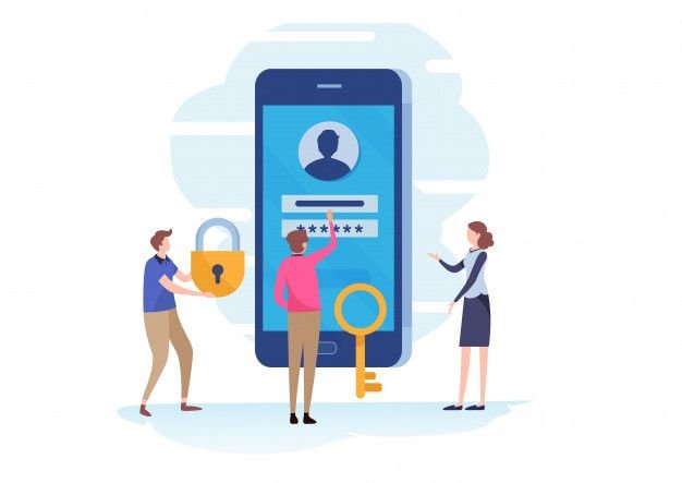
    An illustration highlighting mobile-first website design, featuring three individuals interacting with a large smartphone displaying a login interface with a user profile and password field. One person holds a padlock, another uses a key, and the third gestures toward the screen, symbolizing secure and accessible mobile-first website design with a focus on user authentication and protection.

    The ever-changing digital scenario is demanding innovation in every way possible. In such cases, what we need is a new way of thinking. Mobile-first website design is not optional but essential in the current digital era. The businesses that fail to optimise their websites to be mobile-friendly risk losing visibility, traffic, and potential customers with the changing Google algorithm. What Google wants is mobile-friendly websites. In 2025, having a mobile-first design isn’t just about aesthetics; it’s about delivering seamless user experiences and improving search engine rankings.

    An illustration showcasing mobile-first website design, featuring a hand holding a smartphone with a Google Search page open, and various icons (globe, play button, heart, camera, shopping cart) connected by a dotted line, symbolising seamless navigation and functionality. A desktop screen is visible in the background, emphasising the responsive design across devices.

    What Is Mobile-First Website Design?

    Designing a website primarily for mobile devices and then optimising it for larger screens, such tablets and PCs, is known as mobile-first website design. This strategy guarantees that visitors on smartphones, who account for the bulk of web traffic, have a flawless and optimised experience.

    Why Mobile-First Design Matter for SEO?

    1. Mobile-First Indexing of Google

    With its complete shift to mobile-first indexing, Google now ranks websites based solely on their mobile version. If your website isn’t responsive, it can rank lower and be less visible in search results. Mobile-first website design does make a difference in Google ranking.

    2. Faster Load Times Improve Rankings

    One important ranking factor is speed. SEO suffers when a website loads slowly because bounce rates rise. The goal of a mobile-first website design is to maximise speed using methods like effective caching, lightweight code, and picture compression.

    3. Better User Experience Reduces Bounce Rates

    A mobile website that is responsive and simple to use keeps users interested. Visitors are more likely to abandon a website that is difficult for them to explore or read on a mobile device, which tells search engines that the page is not user-friendly. So, guys, never underestimate the importance of a mobile-first website design!

    4. Higher Local Search Visibility

    Websites that prioritise mobile optimisation rank higher in local search results, particularly for companies that cater to local clients. Mobile-first website design is a ranking criterion for local SEO according to Google, which makes it simpler for potential clients to locate and get in touch with your company.

    5. Increased Conversions and Engagement

    Whether a customer is calling a business, making a purchase, or scheduling an appointment, a smooth mobile experience promotes higher conversions. Contact information, forms, and call-to-action buttons are all made available with a mobile-first design.

    Key Elements of a Mobile-Friendly Website

    Certain key elements decide whether a website has a mobile-first website design. Let’s analyse some of them.

    • Responsive Design: Ensures the website adapts to different screen sizes.
    • Fast Loading Speed: Optimize images, use caching, and minimize code.
    • Thumb-Friendly Navigation: Ensure buttons and menus are easy to tap.
    • Readable Fonts and Content: Avoid small text that requires zooming.
    • Optimized Media: Use adaptive images and video formats that load efficiently.

    How does Google React to Websites that are mobile friendly?

    Google has responded to the increasing number of people using mobile devices to access the internet by focusing on mobile-first indexing. By prioritising the mobile user experience, a mobile-first website design ensures responsive layouts, quick loading times, and simple navigation on smaller devices.

    Google formally implemented mobile-first indexing in 2018, meaning that a website’s mobile version is now used as the main indexing and ranking source. Your website will probably rank higher in search results if it is mobile-friendly. Conversely, websites that are not responsive to mobile devices can experience a decline in traffic and exposure. So, business owners, don’t ever compromise with a mobile-first website design

    How is a mobile-friendly design tied to Google’s Core Web Vitals?

    Google’s Core Web Vitals, a collection of user experience criteria that affect search rankings, are linked to mobile-first design. These include visual stability, interaction, and loading speed—all essential components of a mobile-friendly website.

    Google’s algorithms consider many factors when assessing a mobile-first website design, including responsive design, mobile usability, content parity across desktop and mobile versions, and page speed. Websites that load rapidly and work flawlessly on all devices are preferred. Buttons should be simple to click, and content should be readable without the need for zooming or horizontal scrolling.

    Google supports this by offering developers tools like PageSpeed Insights and Mobile-Friendly Test to assist them in optimising their websites for mobile-first indexing. These tools provide information on usability problems and make recommendations for enhancements to improve the mobile experience.

    An illustration depicting mobile-first website design, featuring a diverse group of people using smartphones and tablets, connected by a network of global and digital icons (globe, chat bubbles, gears) symbolizing seamless connectivity and user experience. The background includes cloud elements and interconnected lines, highlighting the importance of responsive and efficient mobile-first website design across a global audience.

    Conclusion

    In 2025, having a mobile-first website design is essential for SEO success. Businesses may raise their overall search ranks, increase their exposure in local searches, and increase foot traffic, calls, and inquiries by putting a high priority on responsiveness, quick load speeds, and mobile-friendly features. Now is the moment to make the switch and maintain your top search engine rating if you haven’t already optimised your website for mobile.

    Website Design in Kochi;The importance of accessibility

    In today’s digital era, websites have become an integral part of daily life. Accessibility in website development is crucial in Kochi, just as it is across the globe. Web accessibility goes beyond compliance; it ensures equal access for all users, including individuals with disabilities, allowing them to navigate, interact, and benefit from websites. The article below discusses the importance of accessibility specifically when it comes to website design in Kochi.

    Why Is Accessibility Important in Website Design in Kochi?

    Accessibility is a crucial aspect of website design in Kochi, ensuring that websites are user-friendly for everyone, including people with disabilities. A well-designed, accessible website enhances user experience, improves SEO, and helps businesses reach a wider audience. With the growing digital landscape in Kerala, having an inclusive website design in Kochi ensures compliance with global standards and provides equal access to information. Businesses that prioritize accessibility not only improve their brand reputation but also create a more engaging and seamless experience for all users. By implementing accessibility best practices, websites become more navigable, readable, and functional for diverse audiences.

    • Inclusivity: Accessibility ensures that all users, including those with disabilities, can engage with digital content, promoting inclusiveness.
    • Enhanced SEO Rankings: The website design in Kochi that prioritizes accessibility improves usability, which positively impacts search engine rankings
    • Wider Audience Reach: The website design in Kochi with accessibility features attracts a diverse user base, ensuring no one is excluded.
    • Mobile-Friendly Adaptation: Accessibility enhances usability across all devices, crucial for Kochi’s growing mobile user base.
    Laptop displaying 'Website Development' on a screen, representing professional website design services in Kochi, with a modern and creative approach.

    Benefits of Implementing Accessible Web Design

    While creating a website deisgn in Kochi and for other locations as well, one must take into account that your website must be user-friendly, can reach a wider audience, have better SEO performance and should give a positive brand reputation

    1. Improved User Satisfaction and Support

    An accessible website ensures ease of use for all individuals, including those with disabilities. Features such as screen reader compatibility, keyboard navigation, and proper color contrast enhance user interaction. A seamless user experience reduces frustration, encouraging users to engage, return, and interact with your website.

    2. Expanded Audience Reach

    By adopting accessibility features, businesses can cater to individuals with visual, auditory, motor, or cognitive impairments. This broadens the customer base, reflecting a commitment to inclusivity and making the website welcoming for all users.

    3. Better SEO Performance

    Search engines favor accessible websites. Properly structured headings, alternative text for images, and clear navigation improve both user experience and search engine comprehension. Investing in accessibility enhances visibility, helping your website rank higher in search results.

    4. Positive Brand Reputation

    An accessible website demonstrates social responsibility and a commitment to diversity and inclusion. Knowing this plays a keyrole while creating website design. Businesses that prioritize accessibility often gain a positive reputation, distinguishing themselves from competitors and fostering customer loyalty.

    Tips for Creating an Inclusive Website design in kochi

    Creating an inclusive website is the best way to boost your brand growth. For the best website design in Kochi, you need to take note of certain points. One among them is creating an inclusive website.

    1. Utilize Semantic HTML: Properly tag elements to enhance screen reader accessibility.
    2. Provide Alt Text for Images: Assist visually impaired users by offering descriptive image text.
    3. Ensure High Color Contrast: Enhance readability for users with visual impairments.
    4. Implement Responsive Design: Optimize websites for seamless access across devices, particularly smartphones, which are dominant in Kochi.
    5. Conduct Regular Accessibility Testing: Use accessibility tools and user feedback to refine website usability.
    6. Maintain Clear and Consistent Navigation: Well-structured navigation helps users locate information quickly. Use descriptive link text instead of generic phrases like “Click here.” Breadcrumbs and consistent menu placements enhance clarity.

    Why Website Accessibility Matters: Attract More Customers by Being Inclusive

    Ensuring accessibility is a strategic advantage for businesses. When it comes to website design in Kochi, it’s importance assumes another level. Many companies lose potential customers due to inaccessible websites. For instance, a visually impaired user relying on a screen reader may find it impossible to navigate a poorly designed website. In a business-driven city like Kochi, where digital services are expanding, accessibility is a crucial factor in attracting and retaining customers.

    Neglecting accessibility alienates users and limits potential growth. Conversely, embracing accessibility fosters trust, enhances user experience, and gives businesses a competitive edge.

    Principles of Web Design; a guide for website design in kochi market

    The Web Content Accessibility Guidelines (WCAG) define four fundamental principles, collectively known as POUR. Know these and learn how it makes a differnce for website design in Kochi:

    • Perceivable: Ensure all content is presented in a way that can be easily recognized by users with different abilities.
    • Operable: Facilitate navigation and interaction through various tools, such as screen readers and keyboard shortcuts.
    • Understandable: Structure content and navigation in a clear, intuitive manner for all users.
    • Robust: Develop websites compatible with assistive technologies, ensuring longevity and adaptability.

    Conclusion

    Website accessibility is not just a compliance requirement; it is a necessity in the digital landscape of Kochi and beyond. Ensuring equal access for all users, including individuals with disabilities, improves business outreach, enhances SEO performance, and strengthens brand credibility.

    By adhering to WCAG principles and focusing on perceivability, operability, understandability, and robustness, businesses can create websites that serve both users and organizations effectively. In an evolving digital economy, accessibility is not just an option, it is a strategic imperative for success. Make a difference for your brand’s growth with the best website design in Kochi

    How Does Upswing Digital Make a Difference in Website design in kochi arena?

    For website design in Kochi, Upswing Digital is your go-to partner. They provide innovative, user-friendly, and SEO-optimized websites that are customised to meet your company’s demands. Our skilled team creates responsive, quick-loading, and aesthetically beautiful websites that improve user experience by fusing creativity and technology. Whether you require an e-commerce platform, business website, or personal blog, we offer flawless functionality and mobile compatibility. We assist companies in creating a strong online presence with an emphasis on digital strategy, UI/UX, and branding. For creative solutions, unparalleled support, and a website that accurately reflects your business in the cutthroat digital market, pick Upswing Digital.