
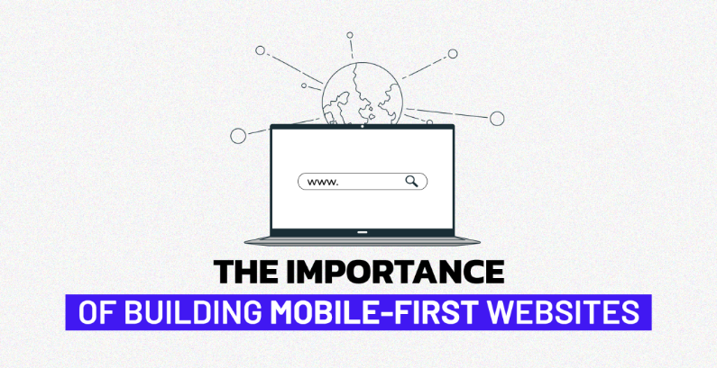
Why Mobile-First Website Design matters?
In today’s digital era, smartphones are no longer just communication tools, they’re the primary gateway to the internet. With over half of global web traffic coming from mobile devices, having a mobile-first website design is no longer optional. It’s a necessity.
At Upswing Digital, we believe that businesses must prioritize user experience (UX), speed, and functionality on mobile screens first to ensure they stay competitive. In this blog, we’ll explore the concept of mobile-first design, why it matters, and how it benefits your business from both an SEO and user engagement standpoint.
What Is Mobile-First Website Design?
Mobile-first website design is a design strategy that starts with the mobile version of a website and then scales up for larger screens like tablets and desktops. Rather than designing a desktop website and then shrinking it to fit smaller devices, mobile-first begins with the smallest screen and builds upward.
This approach ensures that essential content, functions, and user experiences are optimized for mobile users before adding layers of complexity for larger devices.
Key Characteristics of Mobile-First Website Design:
- Simplified navigation
- Fast loading speed
- Touch-friendly UI elements
- Prioritized content
- Responsive design framework
Why does It MATTER in 2025?
1. The Rise in Mobile Users
According to recent data, mobile devices account for more than 60% of total web traffic globally. Consumers are browsing, shopping, and engaging with content more on mobile than desktop. If your website isn’t designed with these users in mind, you risk losing a significant chunk of potential customers.
2. Improved User Experience
User experience is at the core of any successful digital strategy. A website that is hard to navigate on a mobile device will likely frustrate users and cause them to bounce. Mobile-first websites ensure that:
- Buttons are easy to tap
- Content is readable without zooming
- Pages load quickly on mobile networks
- Menus are simplified and accessible
Happy users are more likely to stay longer, engage with content, and convert into customers.
3. SEO Benefits
Google uses mobile-first indexing, which means it primarily uses the mobile version of your content for ranking and indexing purposes. If your mobile site is subpar, your SEO rankings could suffer.
Benefits of mobile-first for SEO:
- Faster load times (a ranking factor)
- Lower bounce rates
- Better usability signals to Google
- Higher chances of appearing in local search
4. Faster Page Load Speed
Page speed is critical, especially on mobile. Mobile-first designs focus on lightweight code, optimized images, and minimal scripts that improve performance. Since many users rely on mobile networks rather than broadband, a quick-loading mobile site can significantly enhance engagement.
Tips for faster mobile load times:
- Compress images
- Use lazy loading
- Minimize CSS and JavaScript
- Choose mobile-optimized fonts
5. Increased Conversions
Users behave differently on mobile than on desktop. They expect fast, easy access to information and streamlined actions. A mobile-first website focuses on:
- Simplified forms
- One-click call buttons
- Easy checkouts
- Minimal distractions
By making conversions easier on smaller screens, you increase the likelihood of turning visitors into customers.
Key Elements of Effective Mobile-First Website Design
1. Responsive Design
A responsive website adapts to all screen sizes, whether it’s a smartphone, tablet, or desktop. Mobile-first design ensures that the layout adjusts fluidly, providing consistent UX across devices.
2. Prioritized Content
On a small screen, space is limited. Mobile-first design pushes you to focus on what truly matters. Use clear calls to action (CTAs), concise headlines, and minimal copy to communicate your value fast.
3. Navigation Simplicity
Mega-menus and complex navigations don’t work well on mobile. Use:
- Hamburger menus
- Sticky navigation bars
- Bottom navigation (for thumb access)
This makes your site intuitive and easy to explore on mobile.
4. Touch Optimization
Buttons, forms, and links should be designed for touch, not mouse clicks. That means:
- Larger tap targets
- Adequate spacing between elements
- Minimal typing requirements
5. Minimal Design Approach
A clean, clutter-free mobile interface not only looks modern but also helps reduce load times and improve usability. Focus on white space, flat icons, and lightweight visuals.
Conclusion
Mobile-first website design isn’t just good practice, it’s essential in a mobile-dominated digital world. From better SEO and faster performance to higher user engagement and conversions, the benefits of going mobile-first are clear. Your website should not just “work” on mobile, it should shine on mobile.
If your current website struggles to meet the expectations of mobile users, it’s time for a change. A mobile-first approach sets the stage for long-term digital success, improves user satisfaction, and aligns with search engine best practices. Make your website future-ready, start with mobile.

How AI is Revolutionizing Digital Marketing: The Future Is Already Here
Artificial Intelligence is no longer a futuristic idea it has become the heartbeat of modern marketi

6 effective Social Media trends in 2025
The Future of Social Media Is Here Social media is no longer just a place for likes and shares; it&#

Blogging for Business: How Consistent Content Creation Drives Organic Traffic
In this age where everything happens online, having an online presence is becoming a necessity for a
Leave a Reply